


View our Pricing & Plans for a detailed list and comparison of features available in each plan.
A web form is a workflow user task. You can use this user task to construct a web form for a workflow participant (assignee) to complete when the workflow runs. This basic information that you collect in the web form can be used later on in the workflow.
The data collected as the workflow runs can be combined with logic to trigger other fields to appear on the form or determine which path the workflow takes. It can also be used to pre-populate data on another web form, Word document, or PDF (using a Fill & Sign task) so users don’t have to re-enter their data. All this helps minimize errors.
Before You Begin
You need to create a workflow.
Create a Web Form
- In the workflow builder, click either of the following:
- Insert Your First Task!
- the + above or below an existing task.
- In the right sidebar, under User Task, select Web Form. A Web Form task is added to your workflow displaying the task label (name) and assignee.
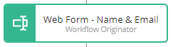
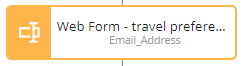
Examples:

Note: An (i) on a workflow task card indicates it has a description. Hover over it to read the description. - Click on the task and in the right sidebar you can configure the task.
Note: Configuration settings are categorized under the following tabs: General Configuration, Page Headers, Add Fields, Actions Buttons, and Reminders. - In the General Configuration tab, set the following:
- Task Label – Modify the default task name from “Web Form” to a name that is meaningful, descriptive, and helps identify the task.
Note: These are listed as event names on the instance list History tab. - Assignee – From the assignee dropdown, select the task assignee. The workflow originator (the person who ran the workflow) will be available for selection along with the other participants invited to the workflow. Or, reference the assignee as a property.
Note: The assignee must be associated by an email address collected in a previous workflow task. - In the Page Headers tab, you can specify a heading and subheading for the form.
- Task Label – Modify the default task name from “Web Form” to a name that is meaningful, descriptive, and helps identify the task.
- In the Add Fields tab, you can add fields to your form.
- Click in the Add your first field dropdown and select a form field type. A form field of the selected type is added to the form builder and listed (in order of adding) in the Add Fields tab under the dropdown.
Note: Re-order your fields by clicking the grab handle on the right side and dragging them. Edit a particular field by clicking it. When filling out a web form, the order of the fields determines the tabbing order (when you press TAB on the keyboard). - To configure the field you can click on it in either location (form designer or right sidebar) and modify the field settings.
Note: See Edit Conditions Modal for more information on showing fields conditionally. - After you have configured it in the right sidebar, click Close Field Settings to return to the Add Fields tab.
- To add more fields, click the Add another field dropdown.
- Click in the Add your first field dropdown and select a form field type. A form field of the selected type is added to the form builder and listed (in order of adding) in the Add Fields tab under the dropdown.
- In the Action Buttons tab, you can add buttons on the form. An action button allows the workflow to progress to the next step. It also allows multiple paths (branches) of completion of the workflow. For example, if a request is accepted it would take one path forward and if rejected would take a different path.
Note: Web forms that start a workflow can only have one button. The button’s behavior can be either of the following:-
- Submit – This button will only be available when all required input is completed and validation has passed. The values will be submitted and saved, and the workflow will continue to the next task.
- Continue without Submit – This button will always be available. All input will be ignored and will not be submitted while continuing to the next task in the workflow.
When you add a second button you will have to choose a button position. The workflow builder will reflect your choice.
The third button onward is grouped under a More Action dropdown on the lower-left of the form.
Note: Adding a third button overrides the button position setting. -
- In the Reminders tab, you can add a Task Reminder or Escalation Reminder. See Reminders and Escalations in Workflows for more information.
- After you’ve configured all your fields, at the upper-left corner click <- Return to Workflow Model.

Field Types
Field types determine the type of data an assignee can enter into the field. Fields can also be pre-filled and you can choose to make it editable by the assignee. The available field types are:
Text Input – Allows the assignee to enter text in the field. It is a versatile field type. You can choose to pre-fill it or not. The text that is input must conform to the data type you set. It can be Currency ($ sign is added in the field), Email, Number, SSN/TIN, Phone, Text, URL, Zip Code.
For some data types you can:
- choose how the data entered will be formatted (e.g., phone number)
- restrict what the user can input (e.g., number).
- pre-fill the field with information from the user’s profile (e.g., email address). A user can overwrite this pre-filled field if it has been set to be editable.
- set a custom mask (e.g., a text field of date type that requires input to be entered as mm/dd/yyyy will be 99/99/9999).
Note: A custom mask will allow the workflow participant to only enter certain characters into a field. When filling out the custom mask, ‘9’ will be treated as any number, ‘a’ will be treated as any alphabet, and ‘*’ will be treated as any number or alphabet. All other characters will be treated as literals.
ex: D: 999-9999-999a
If ‘a’, ‘9’, or ‘*’ need to be treated as literals, then ‘\’ should be placed in front of the character.
ex: \a:9999
Multi-Line Text – Allows the assignee to enter multiple lines of text, expanding as needed.
Email Address – Allows the assignee to enter an email address. You can choose to pre-fill from a property, not pre-fill, use the user profile (your) email, or use a default value. You can restrict the domain by specifying the ones to exclude.
Date Picker – Allows the assignee to choose a date from the standard calendar date picker widget. You can pre-fill the date field and choose to allow/restrict the assignee editing it.
Date Range Picker – Allows the assignee to choose a date range (start and end dates) from the standard calendar date picker widget. You can choose to specify boundaries (ranges) for the date range or use the date the web form is acted upon plus a minimum and/or maximum duration.
Multiple Choice – Allows the assignee to select from the multiple choices using the display type (dropdown or radio buttons) you offer. Select a Value Type of Text, Email, or Number from the dropdown.
Checkbox Collection – Allows the assignee to select one or more checkboxes. To validate the checkbox selection use Collection Validation to set the minimum and maximum number of checkboxes that can be selected.
Note: When you select Collection Validation, the checkbox collection automatically becomes a required field.
File Upload – Allows the assignee to upload a single file or multiple files. For multiple files you can choose to combine it into a PDF file and name it. You can specify if all or specific file types are accepted. The dropdown is pre-populated with files uploaded from previous web forms in the workflow.
Instruction – Compose a message in this read-only text field to display for an assignee when the workflow is run. Add hyperlinks and format your message to suit your specifications. You can use it to provide instructions.
Image – Upload an image to display on your web form. See Add an Image to a Web Form (Workflow) for information on configuring the Image field in your Web Form.
Video – Upload a video to display on your web form. Enter the URL to the video to include it in your web form.
Group Heading – Inserts a dark horizontal divider with a light label in your form so you can cluster fields together under a heading. For example, when you want to group all “Vendor Information” together, separate from “P.O. Request Information”.
Modify the group heading color using Form Accent Color in the Organization Branding or Workspace Branding settings. See Customize your Organization and Workspace Branding for more information.
Separator – Inserts a horizontal line that you can use to separate fields or sections of your web form.
Field Settings
Field settings options vary based on the field type selected. Click on a field to access its settings. Next to some settings are a circle with a question mark; click it to read more about a setting. Most of the field types have some common setting options:
Field Label – The visible label (name) identifying the field on the form.
Property Name – The name you assign to the field and to reference the field’s value in a subsequent task. For example, assigning a property name of User_Email_Address to an email address field will allow you to send an email to the user by listing User_Email_Address as the recipient in a subsequent email task.
Data Type – Select a data type to apply a mask to the field and restrict the user to only enter that specific type of data.
Field Size – The size of the field on the form.
Required checkbox – Select this checkbox to add an asterisk to the field and prevent an assignee from progressing through the workflow without filling the field.
Read-Only checkbox – Select this checkbox to make the field non-interactive to the assignee. They will be able to see the current value but not make changes to this field when completing their task. The field value could be from another form or field with the same property name. For example, if you’ve already asked a user for a mailing address on a previous form, this value can be inserted into the current form as well.
Visibility Settings – Always or conditionally show the field. If you choose Conditionally show field you can:
- add conditions to be met using properties (using the data values from Multiple Choice fields and all types of text fields) to determine when the field should be displayed.
- set how this field takes up space on the web form when inactive by setting the Visibility Type as:
- removed (rest of the fields appear on the web form as if this is absent),
- hidden (shows white space where this field would have been), or
- disabled (displays the field as inactive).
Basically, conditionally shown fields allow you to remove, hide, or disable a field until all of the conditions that you define are met. Watch the Using Conditional Logic video!
Known Limitations
- If two properties have the same name, the workflow engine will overwrite the value in the first version of the property with that of the second one that is further down in the web form.
Related Information
Create a Workflow
Add an Image to a Form (Workflow)
Using Conditional Logic (Video)
All About Workflows (Quick Reference)
Additional Resources
Need more help getting set up? Contact us for assistance from our customer support team or register for Office Hours.